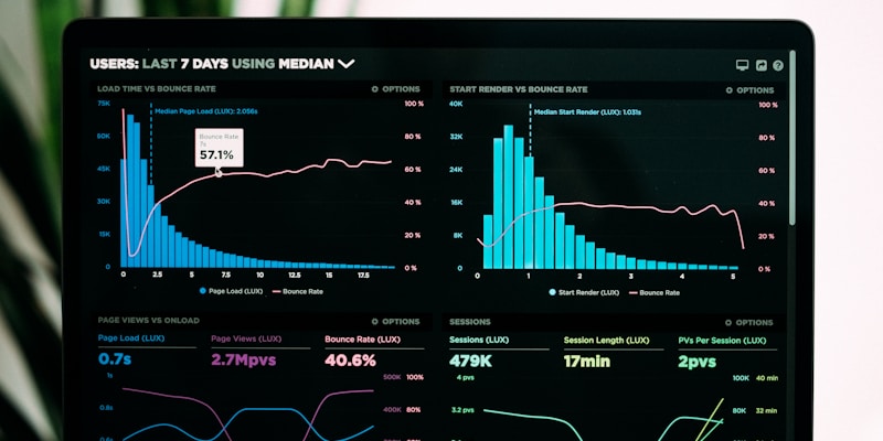
E-commerce Operations Dashboard
Tracking Daily Operations to Improve Customer Experience

Business Problem
The operations team at my company was spending 3-4 hours daily manually collecting data from different systems to create reports. They needed a way to quickly see how orders were performing and identify problems before customers complained.
Goal: Create a simple dashboard that shows key metrics in one place so the team can make faster decisions and improve customer satisfaction.
Data
Data Sources
- Order data (Excel files)
- Customer feedback (CSV)
- Delivery records (SQL database)
- Team performance (Google Sheets)
Key Data Points
- • 2,500+ orders per month
- • 5 different regions
- • 15 team members
- • 6 months of historical data
Approach & Tools
Step 1: Data Cleaning (Excel & Power Query)
Cleaned messy data, removed duplicates, and standardized date formats. Used Power Query to automate data import from multiple sources.
Step 2: Data Analysis (SQL & Excel)
Calculated key metrics like order processing time, delivery success rate, and customer satisfaction scores using basic SQL queries and Excel formulas.
Step 3: Dashboard Creation (Power BI)
Built interactive charts and filters in Power BI. Made it easy for team members to see daily, weekly, and monthly performance at a glance.
Key Insights
Processing Time Issue
Orders were taking 25% longer to process on Mondays and Fridays due to higher volume and fewer staff.
Regional Differences
North region had 15% better delivery rates compared to other regions - found they had better local partnerships.
Customer Satisfaction Pattern
Customer complaints dropped by 30% when orders were processed within 24 hours instead of 48 hours.
Team Performance
Team members with more training had 20% fewer errors in order processing.
Business Impact
The dashboard helped the operations team reduce order processing time by 18% and improve customer satisfaction scores from 3.2 to 4.1 out of 5.
Daily time saved on reporting
Faster order processing
Customer satisfaction score
Practical Changes Made:
- • Added extra staff on Mondays and Fridays
- • Shared North region's best practices with other regions
- • Set up alerts when orders exceed 24-hour processing time
- • Started monthly training sessions for team members
What I Learned
Technical Skills
- • How to clean messy data using Power Query
- • Writing basic SQL queries to calculate metrics
- • Creating user-friendly dashboards in Power BI
- • Automating data refresh to save time
Business Skills
- • Understanding what metrics matter to operations teams
- • Presenting data insights in simple terms
- • Getting user feedback to improve dashboards
- • Connecting data findings to real business actions
Next Steps & Improvements
- • Add more detailed customer feedback analysis
- • Include cost tracking for different regions
- • Set up automated email alerts for urgent issues
- • Create mobile-friendly version for field staff
Want to See More Projects Like This?
I'm always working on new data analysis projects to improve business operations.